Human Centered Design, Web

Checklist for Designing Killer Front end Design Guideline


It’s all about front-end guides for web designers and developers. But to most its just bootstrap, foundation, uikit, materializecss, concisecss or any other with which they are comfortable. But big companies usually work with there own front end design guideline which they use it to design their websites, apps. So what is the best way to design a killer front end design guide, well here is it. Here are some key points that should be present in any front end design guidelines.

typo

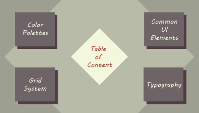
  1. Table of content: The most important is the Table of content. This will allows the users to surf throw your guidelines easily and this will actually act like a sitemap to your design.
  2. Common UI Elements: that is the heart of any front-end style guide. For.e.g Grid-Layouts, Buttons, Breadcrumbs, navigation and modal dialog and there behaviors. These elements can be of static and dynamic nature (in terms of behavior).
    1. Static elements are those that can be designed and coded through the HTML and CSS and not involving any JavaScript. These elements are mostly basic elements like form elements, accordions, dialog boxes and others. Pretty much any tools that can be manipulated with CSS.
    2. Dynamic elements are the ones which involves the JavaScript, They are more detailed and more behavioral elements like Opening of Dialog boxes, Drop down elements of navbars, Accordions, Tabs, Tool tips, Main sliders, Carousels and it could be certain plugins like reducing the size of the header logo on scroll and many other cool stuff. In simple term they put life into elements and define there behaviors.
  3. Color Palettes: Just like brand guide-line’s Color palette, that allows the users to understand the colors of the company, Front end color palette is a must for  to represents how the company’s presence will looks and feels like on the web.A proper Color palette of the company must be present including the colors for UI Elements must be defined. This is a great help for the designer and developers “who are lazy” lol.. to pick and use instantly.
  4. Grid system: This is a layout system that defines how each element will be organized on screens. Both for responsive or adaptive designs this helps to decide how the element will be placed. Grid systems are responsible for the block structure of the web.Most common examples to understand this is the 12-column,16-column. Although, thanks to bootstrap 12-column is mostly used in websites today.
  5. Typography: Type is one of the key element to share meaningful information, not just for human users but also for the Search engines to index your web. Here you only have to worry about the first party that is human users. Typefaces, sizes, weights should be well structured and defined for (paragraphs, headings, quotes, image captions)

Before anyone files plagiarism case here is the original article that inspired me to write. The following article handsomely explain what front-end guide lines are.  I encourage everyone to go and have a read.

Reference: https://www.nngroup.com/articles/front-end-style-guides/

Standard
Human Centered Design, Web

Department Directed Approach (DDA) for designing better feedback forms.

Out of the few major concerns that are related to corporate websites is to provide a healthy way for its visitors to contact them, The best way that any company accomplishes this is by providing an interface to its leads (Visitors), i.e. contact us page either on their website, social page, community page or elsewhere. Now, the issue comes from young designers/developers and some times by experienced ones that they often display company or company’s representative email open in public. Well, It is a useful technique if you ask me, i.e. to let the leads (visitors) directly contact the representative by displaying their email. We should know that it’s not always leading that surf the website.

There is yet another community that lurks for opportunities to gain access to corporate networks i.e. spammers and potential hackers. Corporate organizations take many measures to avoid such attentions by spending a lot on firewall technologies. Being developers one way to avoid such attention is to develop meaningful contact forms that allow it’s visitors to directly contact the representative providing him with enough information to contact the lead back. I call this DDA technique more about it in the latter part of the article.

Now, designing a contact form is a simple and easy task why should we care so much about them and why should we invest so much in them. Well, human beings if you ask me are more focused on telling their story. If we design the forms in a way that will allow the users to explain their problem as if they were communicating personally will not only help both parties i.e The lead and representative, but it will connect them both emotionally. DDA (Department Directed Approach) helps the corporation to design contact us page that will allow the leads to select a particular department and let them explain there story and concerns. Later, allowing the leads to define a proper feedback medium for the representative to contact back is a more humanistic approach to design forms. Based on the above scenario we divide the approach into three major sections.

  1. Whom the message is sent to.
  2. What message is being sent?
  3. Declaring a proper feedback medium.


1.Whom the message is sent to

Whenever we want to give a message, the first step after defining the message to is to define who are we giving the message to. The implementation model can be via a simple combo box with selection to whom the receiver of the message will be. i.e could be a department or an individual or a team. This will define based on a selection where the email should go.

concerned-combo


2. What message is being sent

After the who is figured out then we enter the main message of what our concern is. Here the implementation model depends upon the corporation i.e. the details in this section depend upon are details that the company requires for the lead. My take on this is to make it as simple as possible. I usually limit this to two fields i.e. lead’s name and lead’s concern or detailed message.

3. Declare a proper feedback medium with the message.

Keep it simple is the goal. Once the lead has mentioned the message (concern) then the next phase is to wait for a reply from the concerned representative. Now, How will that be done? ask the lead to enter his minimum information. The implementation model could be based on corporate requirements! my take on this would be at least email (required) or phone contact.

 It’s not a must that the above order is to be maintained or its a standard of some sort. It is much appreciated because the specified order follows the same trait we explain our problems i.e. by telling a story. Hope this article helps its readers to design human-centred forms.

Standard
Social Media, Web

How does LinkedIn gives you ‘People You May Know’ suggestions

 Introduction

Firstly, anything you may do on LinkedIn is tracked [1]. People You May Know is a friend/link suggestion system by LinkedIn. It helps its users by providing suggestions regarding other contacts that user may know or either is linked to directly or via other friends. This kind of system has been implemented by various social networking websites in different forms i.e. Facebook, twitter, Myspace, Google plus+ and others. They all have their trademark Friend suggestion algorithms. However, the following document will guide you on a brief and general overview of LinkedIn’s PYMK.

PYMK helps people to join their LinkedIn network and suggests them friends who are directly  or may be indirectly linked with you via sources i.e. friends, skills, company, interests, email lists, address books and etc…


The Process

In generally LinkedIn tracks every activity of a user. There are many ways that it tracks the user activities but here we will only discuss two major methods. Following diagrams explains us the simple process of how PYMK helps its users to track their friends or people that they might know.

1

Fig 1: Friend of a friend might be your friend

2

Fig 2: Import your contacts via your email address

Fig 1: Friend of a Friend might be your Friend gives a general idea of how LinkedIn visually represents PMYK information to its users. It generally tries to link the Commonalities among members. For example, you may have common connections, similar profile information and previous work or educational experiences. [2]


Fig 2: Import your contacts via your email address gives the core concept of how LinkedIn initially allows you to import your contact list via your email addresses. This option is always available later also. LinkedIn imports the contact list from address books of the email attached. The contact list could be your Gmail, Microsoft, and Yahoo Accounts and many other formats. Note: Each email client that you connect will ask you the permission to connect the LinkedIn Client application. If you grant the access only then the Contact suggestion list will be updated. [3]

Where to find PYMK suggestions

According to the current design, one can find the suggestion on the top right corner of the screen. You can click on the button 4 to open the list of current suggestions and proceed to skip or add user.

The same procedure can be carried out if user wants to get suggestions via emails i.e. Gmail, Yahoo, Hotmail and others and invite others from invite your contacts section       


Reference list

[1] George, K. Who Are Those ‘People You May Know’ in LinkedIn’s suggested Connections?.  http://www.thesocialmarketingdiva.com/who-are-those-people-you-may-know-in-linkedins-suggested-connections/. retrieved on 2014, Oct

[2] LinkedIn Help Desk, 2014, May 05 05/09/2014, People You May Know Overview, http://help.linkedin.com/app/answers/detail/a_id/29/~/people-you-may-know-feature—overview#

[3] LinkedIn Help Desk, 2014, August 29, Importing and Inviting your Email Contacts, http://help.linkedin.com/app/answers/detail/a_id/4214, retrieved on October, 2014

Standard